!Boring Software
andy.works ↗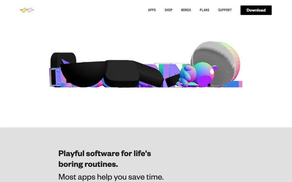
!Boring Software — Design System
North Star
Andy Allen's portfolio for Not Boring software — playful, sticker-rich, app icons as the heroes.
Theme: light
Category: personal
Tags: muted · cool · playful · vibrant · premium · creative · soft-corners · display-fonts
Description
Andy.works is a design playground built around hyper-detailed 3D-rendered app icons (weather, calculator, habits) on a soft pastel canvas. Massive sculpted display numerals like a 3D '2' anchor sections, and the whole page reads like a print magazine spread for a design studio. A signature yellow CTA strip ('Get Updates') hits midway. Type rotates between a confident editorial sans for headers and tight body copy. The personality is craft-obsessed and gleeful.
Colors
| Name | Hex | Group | Role | Tailwind |
|---|---|---|---|---|
| neutral-950 | #000000 | neutral | neutral step 950 | — |
| neutral-700 | #333333 | neutral | neutral step 700 | — |
| neutral-800-1 | #232323 | neutral | neutral step 800 | neutral-800 (Δ0.012) |
| neutral-50 | #ffffff | neutral | neutral step 50 | zinc-50 (Δ0.015) |
| blue-600 | #0000ee | blue | blue step 600 | — |
| neutral-800-2 | #292929 | neutral | neutral step 800 | zinc-800 (Δ0.009) |
Surfaces (Elevation)
| Level | Name | Hex | Purpose |
|---|---|---|---|
| 0 | background | #ffffff | Page background |
| 1 | surface-1 | #333333 | Cards / elevated panels |
| 2 | surface-2 | #292929 | Elevation tier 2 |
| 3 | surface-floor | #000000 | Elevation tier 3 |
Elevation philosophy. Soft elevation throughout — drop shadows on every icon to give material presence. Section background colors create the canvas-tier elevation; the icons float gently above.
Typography
Arial — weight 400
body
Founders Grotesk — weight 700
display
Jet Brains — weight 400
link
Type Scale
| Role | Size | Line-height | Tracking |
|---|---|---|---|
display | 76px | 1 | |
h2 | 76px | 1 | |
h3 | 44px | 1.2 | |
link | 36px | 1 | |
ui-input | 24px | 1.43 | |
body | 14px | 1.43 |
Spacing & Radius
Radius
none: 0sm: 4pxmd: 8px
Spacing
base: 1px
Layout
Long vertical magazine layout — hero icon trio, big paragraph, sculpted numeral, more icons, yellow band, More posts grid. Each section is its own composition.
Imagery
3D-rendered app icons in dimensional, materially-rich detail (glass, foam, metal). Big sculpted typographic moments. A single illustrated photo at the bottom (a couch scene). Otherwise, all imagery is rendered icons.
Do
- Make the app icons the heroes — render them in 3D at huge sizes against soft canvases
- Use display-scale sculpted numerals as section dividers instead of headlines
- Punch a single yellow CTA band into the editorial flow as a high-contrast moment
- Mix soft pastel section backgrounds with white canvas to create rhythm
Don't
- Don't flatten the icons — depth and material are the personality
- Don't use a uniform card grid; mix featured, supporting, and trio layouts
- Don't avoid color — every section should feel slightly different in tone
- Don't lose the playfulness; technical perfection without joy is not the brand
@import "tailwindcss";

@theme {
  /* palette */
  --color-neutral-950: #000000;
  --color-neutral-700: #333333;
  --color-neutral-800-1: #232323;
  --color-neutral-50: #ffffff;
  --color-blue-600: #0000ee;
  --color-neutral-800-2: #292929;

  /* surfaces */
  --color-surface-0: #ffffff;
  --color-surface-1: #333333;
  --color-surface-2: #292929;
  --color-surface-3: #000000;

  /* fonts */
  --font-arial: "Arial", ui-sans-serif, system-ui, sans-serif;
  --font-founders-grotesk: "Founders Grotesk", ui-sans-serif, system-ui, sans-serif;
  --font-jet-brains: "Jet Brains", ui-sans-serif, system-ui, sans-serif;

  /* type scale (utilities: text-{role}, leading-{role}, tracking-{role}) */
  --text-display: 76px;
  --text-display--line-height: 1;
  --text-display--letter-spacing: nullpx;
  --text-h2: 76px;
  --text-h2--line-height: 1;
  --text-h2--letter-spacing: nullpx;
  --text-h3: 44px;
  --text-h3--line-height: 1.2;
  --text-h3--letter-spacing: nullpx;
  --text-link: 36px;
  --text-link--line-height: 1;
  --text-link--letter-spacing: nullpx;
  --text-ui-input: 24px;
  --text-ui-input--line-height: 1.43;
  --text-ui-input--letter-spacing: nullpx;
  --text-body: 14px;
  --text-body--line-height: 1.43;
  --text-body--letter-spacing: nullpx;

  /* radii (utilities: rounded-{name}) */
  --radius-none: 0;
  --radius-sm: 4px;
  --radius-md: 8px;

  /* spacing (utilities: p-{key}, m-{key}, gap-{key}, …) */
  --spacing-base: 1px;
}
:root {
  /* palette */
  --color-neutral-950: #000000;
  --color-neutral-700: #333333;
  --color-neutral-800-1: #232323;
  --color-neutral-50: #ffffff;
  --color-blue-600: #0000ee;
  --color-neutral-800-2: #292929;

  /* surfaces */
  --surface-0: #ffffff;
  --surface-1: #333333;
  --surface-2: #292929;
  --surface-3: #000000;

  /* type scale */
  --text-display: 76px;
  --leading-display: 1;
  --tracking-display: nullpx;
  --text-h2: 76px;
  --leading-h2: 1;
  --tracking-h2: nullpx;
  --text-h3: 44px;
  --leading-h3: 1.2;
  --tracking-h3: nullpx;
  --text-link: 36px;
  --leading-link: 1;
  --tracking-link: nullpx;
  --text-ui-input: 24px;
  --leading-ui-input: 1.43;
  --tracking-ui-input: nullpx;
  --text-body: 14px;
  --leading-body: 1.43;
  --tracking-body: nullpx;

  /* font families */
  --font-arial: "Arial", ui-sans-serif, system-ui, sans-serif;
  --font-founders-grotesk: "Founders Grotesk", ui-sans-serif, system-ui, sans-serif;
  --font-jet-brains: "Jet Brains", ui-sans-serif, system-ui, sans-serif;

  /* radii */
  --radius-none: 0;
  --radius-sm: 4px;
  --radius-md: 8px;

  /* spacing */
  --spacing-base: 1px;
}
{
  "theme": "light",
  "category": "personal",
  "tags": [
    "muted",
    "cool",
    "playful",
    "vibrant",
    "premium",
    "creative",
    "soft-corners",
    "display-fonts"
  ],
  "northStar": "Andy Allen's portfolio for Not Boring software — playful, sticker-rich, app icons as the heroes.",
  "description": "Andy.works is a design playground built around hyper-detailed 3D-rendered app icons (weather, calculator, habits) on a soft pastel canvas. Massive sculpted display numerals like a 3D '2' anchor sections, and the whole page reads like a print magazine spread for a design studio. A signature yellow CTA strip ('Get Updates') hits midway. Type rotates between a confident editorial sans for headers and tight body copy. The personality is craft-obsessed and gleeful.",
  "colors": [
    {
      "name": "neutral-950",
      "hex": "#000000",
      "group": "neutral",
      "role": "neutral step 950",
      "tailwind": null
    },
    {
      "name": "neutral-700",
      "hex": "#333333",
      "group": "neutral",
      "role": "neutral step 700",
      "tailwind": null
    },
    {
      "name": "neutral-800-1",
      "hex": "#232323",
      "group": "neutral",
      "role": "neutral step 800",
      "tailwind": {
        "name": "neutral-800",
        "hex": "#262626",
        "deltaE": 0.012
      }
    },
    {
      "name": "neutral-50",
      "hex": "#ffffff",
      "group": "neutral",
      "role": "neutral step 50",
      "tailwind": {
        "name": "zinc-50",
        "hex": "#fafafa",
        "deltaE": 0.015
      }
    },
    {
      "name": "blue-600",
      "hex": "#0000ee",
      "group": "blue",
      "role": "blue step 600",
      "tailwind": null
    },
    {
      "name": "neutral-800-2",
      "hex": "#292929",
      "group": "neutral",
      "role": "neutral step 800",
      "tailwind": {
        "name": "zinc-800",
        "hex": "#27272a",
        "deltaE": 0.009
      }
    }
  ],
  "surfaces": [
    {
      "level": 0,
      "name": "background",
      "hex": "#ffffff",
      "purpose": "Page background"
    },
    {
      "level": 1,
      "name": "surface-1",
      "hex": "#333333",
      "purpose": "Cards / elevated panels"
    },
    {
      "level": 2,
      "name": "surface-2",
      "hex": "#292929",
      "purpose": "Elevation tier 2"
    },
    {
      "level": 3,
      "name": "surface-floor",
      "hex": "#000000",
      "purpose": "Elevation tier 3"
    }
  ],
  "elevationPhilosophy": "Soft elevation throughout — drop shadows on every icon to give material presence. Section background colors create the canvas-tier elevation; the icons float gently above.",
  "typography": [
    {
      "family": "Arial",
      "weight": "400",
      "role": "body",
      "fontFeatureSettings": null,
      "substitute": null
    },
    {
      "family": "Founders Grotesk",
      "weight": "700",
      "role": "display",
      "fontFeatureSettings": null,
      "substitute": null
    },
    {
      "family": "Jet Brains",
      "weight": "400",
      "role": "link",
      "fontFeatureSettings": null,
      "substitute": null
    }
  ],
  "typeScale": [
    {
      "role": "display",
      "size": 76,
      "lineHeight": 1,
      "letterSpacing": null
    },
    {
      "role": "h2",
      "size": 76,
      "lineHeight": 1,
      "letterSpacing": null
    },
    {
      "role": "h3",
      "size": 44,
      "lineHeight": 1.2,
      "letterSpacing": null
    },
    {
      "role": "link",
      "size": 36,
      "lineHeight": 1,
      "letterSpacing": null
    },
    {
      "role": "ui-input",
      "size": 24,
      "lineHeight": 1.43,
      "letterSpacing": null
    },
    {
      "role": "body",
      "size": 14,
      "lineHeight": 1.43,
      "letterSpacing": null
    }
  ],
  "spacing": {
    "radius": {
      "none": "0",
      "sm": "4px",
      "md": "8px"
    },
    "base": "1px"
  },
  "layout": "Long vertical magazine layout — hero icon trio, big paragraph, sculpted numeral, more icons, yellow band, More posts grid. Each section is its own composition.",
  "imagery": "3D-rendered app icons in dimensional, materially-rich detail (glass, foam, metal). Big sculpted typographic moments. A single illustrated photo at the bottom (a couch scene). Otherwise, all imagery is rendered icons.",
  "dos": [
    "Make the app icons the heroes — render them in 3D at huge sizes against soft canvases",
    "Use display-scale sculpted numerals as section dividers instead of headlines",
    "Punch a single yellow CTA band into the editorial flow as a high-contrast moment",
    "Mix soft pastel section backgrounds with white canvas to create rhythm"
  ],
  "donts": [
    "Don't flatten the icons — depth and material are the personality",
    "Don't use a uniform card grid; mix featured, supporting, and trio layouts",
    "Don't avoid color — every section should feel slightly different in tone",
    "Don't lose the playfulness; technical perfection without joy is not the brand"
  ],
  "brandColor": {
    "hex": "#0000ee",
    "source": "heuristic",
    "chroma": 0.297
  }
}
{
"theme": "light",
"category": "personal",
"tags": [
"muted",
"cool",
"playful",
"vibrant",
"premium",
"creative",
"soft-corners",
"display-fonts"
],
"northStar": "Andy Allen's portfolio for Not Boring software — playful, sticker-rich, app icons as the heroes.",
"description": "Andy.works is a design playground built around hyper-detailed 3D-rendered app icons (weather, calculator, habits) on a soft pastel canvas. Massive sculpted display numerals like a 3D '2' anchor sections, and the whole page reads like a print magazine spread for a design studio. A signature yellow CTA strip ('Get Updates') hits midway. Type rotates between a confident editorial sans for headers and tight body copy. The personality is craft-obsessed and gleeful.",
"colors": [
{
"name": "neutral-950",
"hex": "#000000",
"group": "neutral",
"role": "neutral step 950",
"tailwind": null
},
{
"name": "neutral-700",
"hex": "#333333",
"group": "neutral",
"role": "neutral step 700",
"tailwind": null
},
{
"name": "neutral-800-1",
"hex": "#232323",
"group": "neutral",
"role": "neutral step 800",
"tailwind": {
"name": "neutral-800",
"hex": "#262626",
"deltaE": 0.012
}
},
{
"name": "neutral-50",
"hex": "#ffffff",
"group": "neutral",
"role": "neutral step 50",
"tailwind": {
"name": "zinc-50",
"hex": "#fafafa",
"deltaE": 0.015
}
},
{
"name": "blue-600",
"hex": "#0000ee",
"group": "blue",
"role": "blue step 600",
"tailwind": null
},
{
"name": "neutral-800-2",
"hex": "#292929",
"group": "neutral",
"role": "neutral step 800",
"tailwind": {
"name": "zinc-800",
"hex": "#27272a",
"deltaE": 0.009
}
}
],
"surfaces": [
{
"level": 0,
"name": "background",
"hex": "#ffffff",
"purpose": "Page background"
},
{
"level": 1,
"name": "surface-1",
"hex": "#333333",
"purpose": "Cards / elevated panels"
},
{
"level": 2,
"name": "surface-2",
"hex": "#292929",
"purpose": "Elevation tier 2"
},
{
"level": 3,
"name": "surface-floor",
"hex": "#000000",
"purpose": "Elevation tier 3"
}
],
"elevationPhilosophy": "Soft elevation throughout — drop shadows on every icon to give material presence. Section background colors create the canvas-tier elevation; the icons float gently above.",
"typography": [
{
"family": "Arial",
"weight": "400",
"role": "body",
"fontFeatureSettings": null,
"substitute": null
},
{
"family": "Founders Grotesk",
"weight": "700",
"role": "display",
"fontFeatureSettings": null,
"substitute": null
},
{
"family": "Jet Brains",
"weight": "400",
"role": "link",
"fontFeatureSettings": null,
"substitute": null
}
],
"typeScale": [
{
"role": "display",
"size": 76,
"lineHeight": 1,
"letterSpacing": null
},
{
"role": "h2",
"size": 76,
"lineHeight": 1,
"letterSpacing": null
},
{
"role": "h3",
"size": 44,
"lineHeight": 1.2,
"letterSpacing": null
},
{
"role": "link",
"size": 36,
"lineHeight": 1,
"letterSpacing": null
},
{
"role": "ui-input",
"size": 24,
"lineHeight": 1.43,
"letterSpacing": null
},
{
"role": "body",
"size": 14,
"lineHeight": 1.43,
"letterSpacing": null
}
],
"spacing": {
"radius": {
"none": "0",
"sm": "4px",
"md": "8px"
},
"base": "1px"
},
"layout": "Long vertical magazine layout — hero icon trio, big paragraph, sculpted numeral, more icons, yellow band, More posts grid. Each section is its own composition.",
"imagery": "3D-rendered app icons in dimensional, materially-rich detail (glass, foam, metal). Big sculpted typographic moments. A single illustrated photo at the bottom (a couch scene). Otherwise, all imagery is rendered icons.",
"dos": [
"Make the app icons the heroes — render them in 3D at huge sizes against soft canvases",
"Use display-scale sculpted numerals as section dividers instead of headlines",
"Punch a single yellow CTA band into the editorial flow as a high-contrast moment",
"Mix soft pastel section backgrounds with white canvas to create rhythm"
],
"donts": [
"Don't flatten the icons — depth and material are the personality",
"Don't use a uniform card grid; mix featured, supporting, and trio layouts",
"Don't avoid color — every section should feel slightly different in tone",
"Don't lose the playfulness; technical perfection without joy is not the brand"
],
"brandColor": {
"hex": "#0000ee",
"source": "heuristic",
"chroma": 0.297
}
}