Are.na
www.are.na ↗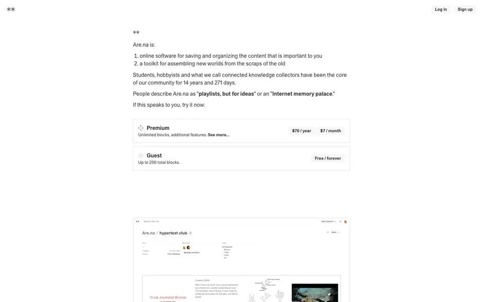
Are.na — Design System
North Star
An 'Internet memory palace' for connected knowledge collectors — quiet, text-first, the opposite of an algorithm.
Theme: light
Category: creative
Tags: cool · serif-heavy · minimal · type-first · achromatic · dense · editorial · creative
Description
Are.na's marketing site is almost defiantly plain — system-style sans, near-white canvas, narrow centered single-column layout, and a deep navy footer. No imagery, no illustration, no hero animation. Pricing tiers, manifesto text, and a single product screenshot are the entire surface. The personality is post-internet quiet — the design system says 'we trust the reader' rather than 'we want your attention'.
Colors
| Name | Hex | Group | Role | Tailwind |
|---|---|---|---|---|
| neutral-700 | #333333 | neutral | neutral step 700 | — |
| neutral-50-1 | #ffffff | neutral | neutral step 50 | zinc-50 (Δ0.015) |
| neutral-950 | #000000 | neutral | neutral step 950 | — |
| neutral-50-2 | #f7f7f7 | neutral | neutral step 50 | neutral-100 (Δ0.006) |
| blue-800 | #00075f | blue | blue step 800 | — |
| neutral-500 | #696969 | neutral | neutral step 500 | — |
| red-200 | #dfbebe | red | red step 200 | — |
| violet-600 | #3d46c2 | violet | violet step 600 | — |
| neutral-100-1 | #dedede | neutral | neutral step 100 | zinc-200 (Δ0.02) |
| green-500 | #238020 | green | green step 500 | green-700 (Δ0.012) |
| neutral-100-2 | #ebecf7 | neutral | neutral step 100 | violet-100 (Δ0.014) |
| green-200 | #b4d6b3 | green | green step 200 | — |
| red-500 | #b93d3d | red | red step 500 | — |
Surfaces (Elevation)
| Level | Name | Hex | Purpose |
|---|---|---|---|
| 0 | background | #ffffff | Page background |
| 1 | surface-1 | #ebecf7 | Cards / elevated panels |
| 2 | surface-2 | #dedede | Elevation tier 2 |
| 3 | surface-3 | #696969 | Elevation tier 3 |
| 4 | surface-floor | #333333 | Elevation tier 4 |
Elevation philosophy. Two tiers only — flat content body and the navy footer band. No shadows. The footer's color shift IS the elevation device.
Typography
Times New Roman — weight 400
serif
areal — weight 400
body
Type Scale
| Role | Size | Line-height | Tracking |
|---|---|---|---|
body | 16px | 1 | |
h3 | 16px | 1.45 | |
h4 | 16px | 1.45 | |
link | 16px | 1 | |
ui-action | 12.5px |
Spacing & Radius
Radius
none: 0sm: 3px
Spacing
base: 100px
Layout
A narrow single-column flow centered on the page: small logo, tier cards, a screenshot, manifesto-style paragraphs, then the deep-navy footer. Vertical rhythm is unhurried.
Imagery
None on the marketing surface. A single product screenshot of the canvas is allowed mid-page; otherwise the page is text.
Do
- Use a centered single-column reading layout with comfortable line length
- Default to a system or near-system sans; let the words be the design
- Anchor the page with a deep navy footer band — the only color moment
- Keep buttons text-first with a thin border, no fills, no gradients
Don't
- Don't add hero imagery, illustration, or color blocks above the fold
- Don't use display-scale typography; mid-size body text is the personality
- Don't shadow or elevate cards — flat surfaces only
- Don't introduce a second accent — navy footer is the only color moment
@import "tailwindcss";

@theme {
  /* palette */
  --color-neutral-700: #333333;
  --color-neutral-50-1: #ffffff;
  --color-neutral-950: #000000;
  --color-neutral-50-2: #f7f7f7;
  --color-blue-800: #00075f;
  --color-neutral-500: #696969;
  --color-red-200: #dfbebe;
  --color-violet-600: #3d46c2;
  --color-neutral-100-1: #dedede;
  --color-green-500: #238020;
  --color-neutral-100-2: #ebecf7;
  --color-green-200: #b4d6b3;
  --color-red-500: #b93d3d;

  /* surfaces */
  --color-surface-0: #ffffff;
  --color-surface-1: #ebecf7;
  --color-surface-2: #dedede;
  --color-surface-3: #696969;
  --color-surface-4: #333333;

  /* fonts */
  --font-times-new-roman: "Times New Roman", ui-sans-serif, system-ui, sans-serif;
  --font-areal: "areal", ui-sans-serif, system-ui, sans-serif;

  /* type scale (utilities: text-{role}, leading-{role}, tracking-{role}) */
  --text-body: 16px;
  --text-body--line-height: 1;
  --text-body--letter-spacing: nullpx;
  --text-h3: 16px;
  --text-h3--line-height: 1.45;
  --text-h3--letter-spacing: nullpx;
  --text-h4: 16px;
  --text-h4--line-height: 1.45;
  --text-h4--letter-spacing: nullpx;
  --text-link: 16px;
  --text-link--line-height: 1;
  --text-link--letter-spacing: nullpx;
  --text-ui-action: 12.5px;
  --text-ui-action--line-height: null;
  --text-ui-action--letter-spacing: nullpx;

  /* radii (utilities: rounded-{name}) */
  --radius-none: 0;
  --radius-sm: 3px;

  /* spacing (utilities: p-{key}, m-{key}, gap-{key}, …) */
  --spacing-base: 100px;
}
:root {
  /* palette */
  --color-neutral-700: #333333;
  --color-neutral-50-1: #ffffff;
  --color-neutral-950: #000000;
  --color-neutral-50-2: #f7f7f7;
  --color-blue-800: #00075f;
  --color-neutral-500: #696969;
  --color-red-200: #dfbebe;
  --color-violet-600: #3d46c2;
  --color-neutral-100-1: #dedede;
  --color-green-500: #238020;
  --color-neutral-100-2: #ebecf7;
  --color-green-200: #b4d6b3;
  --color-red-500: #b93d3d;

  /* surfaces */
  --surface-0: #ffffff;
  --surface-1: #ebecf7;
  --surface-2: #dedede;
  --surface-3: #696969;
  --surface-4: #333333;

  /* type scale */
  --text-body: 16px;
  --leading-body: 1;
  --tracking-body: nullpx;
  --text-h3: 16px;
  --leading-h3: 1.45;
  --tracking-h3: nullpx;
  --text-h4: 16px;
  --leading-h4: 1.45;
  --tracking-h4: nullpx;
  --text-link: 16px;
  --leading-link: 1;
  --tracking-link: nullpx;
  --text-ui-action: 12.5px;
  --leading-ui-action: null;
  --tracking-ui-action: nullpx;

  /* font families */
  --font-times-new-roman: "Times New Roman", ui-sans-serif, system-ui, sans-serif;
  --font-areal: "areal", ui-sans-serif, system-ui, sans-serif;

  /* radii */
  --radius-none: 0;
  --radius-sm: 3px;

  /* spacing */
  --spacing-base: 100px;
}
{
  "theme": "light",
  "category": "creative",
  "tags": [
    "cool",
    "serif-heavy",
    "minimal",
    "type-first",
    "achromatic",
    "dense",
    "editorial",
    "creative"
  ],
  "northStar": "An 'Internet memory palace' for connected knowledge collectors — quiet, text-first, the opposite of an algorithm.",
  "description": "Are.na's marketing site is almost defiantly plain — system-style sans, near-white canvas, narrow centered single-column layout, and a deep navy footer. No imagery, no illustration, no hero animation. Pricing tiers, manifesto text, and a single product screenshot are the entire surface. The personality is post-internet quiet — the design system says 'we trust the reader' rather than 'we want your attention'.",
  "colors": [
    {
      "name": "neutral-700",
      "hex": "#333333",
      "group": "neutral",
      "role": "neutral step 700",
      "tailwind": null
    },
    {
      "name": "neutral-50-1",
      "hex": "#ffffff",
      "group": "neutral",
      "role": "neutral step 50",
      "tailwind": {
        "name": "zinc-50",
        "hex": "#fafafa",
        "deltaE": 0.015
      }
    },
    {
      "name": "neutral-950",
      "hex": "#000000",
      "group": "neutral",
      "role": "neutral step 950",
      "tailwind": null
    },
    {
      "name": "neutral-50-2",
      "hex": "#f7f7f7",
      "group": "neutral",
      "role": "neutral step 50",
      "tailwind": {
        "name": "neutral-100",
        "hex": "#f5f5f5",
        "deltaE": 0.006
      }
    },
    {
      "name": "blue-800",
      "hex": "#00075f",
      "group": "blue",
      "role": "blue step 800",
      "tailwind": null
    },
    {
      "name": "neutral-500",
      "hex": "#696969",
      "group": "neutral",
      "role": "neutral step 500",
      "tailwind": null
    },
    {
      "name": "red-200",
      "hex": "#dfbebe",
      "group": "red",
      "role": "red step 200",
      "tailwind": null
    },
    {
      "name": "violet-600",
      "hex": "#3d46c2",
      "group": "violet",
      "role": "violet step 600",
      "tailwind": null
    },
    {
      "name": "neutral-100-1",
      "hex": "#dedede",
      "group": "neutral",
      "role": "neutral step 100",
      "tailwind": {
        "name": "zinc-200",
        "hex": "#e4e4e7",
        "deltaE": 0.02
      }
    },
    {
      "name": "green-500",
      "hex": "#238020",
      "group": "green",
      "role": "green step 500",
      "tailwind": {
        "name": "green-700",
        "hex": "#008236",
        "deltaE": 0.012
      }
    },
    {
      "name": "neutral-100-2",
      "hex": "#ebecf7",
      "group": "neutral",
      "role": "neutral step 100",
      "tailwind": {
        "name": "violet-100",
        "hex": "#ede9fe",
        "deltaE": 0.014
      }
    },
    {
      "name": "green-200",
      "hex": "#b4d6b3",
      "group": "green",
      "role": "green step 200",
      "tailwind": null
    },
    {
      "name": "red-500",
      "hex": "#b93d3d",
      "group": "red",
      "role": "red step 500",
      "tailwind": null
    }
  ],
  "surfaces": [
    {
      "level": 0,
      "name": "background",
      "hex": "#ffffff",
      "purpose": "Page background"
    },
    {
      "level": 1,
      "name": "surface-1",
      "hex": "#ebecf7",
      "purpose": "Cards / elevated panels"
    },
    {
      "level": 2,
      "name": "surface-2",
      "hex": "#dedede",
      "purpose": "Elevation tier 2"
    },
    {
      "level": 3,
      "name": "surface-3",
      "hex": "#696969",
      "purpose": "Elevation tier 3"
    },
    {
      "level": 4,
      "name": "surface-floor",
      "hex": "#333333",
      "purpose": "Elevation tier 4"
    }
  ],
  "elevationPhilosophy": "Two tiers only — flat content body and the navy footer band. No shadows. The footer's color shift IS the elevation device.",
  "typography": [
    {
      "family": "Times New Roman",
      "weight": "400",
      "role": "serif",
      "fontFeatureSettings": null,
      "substitute": null
    },
    {
      "family": "areal",
      "weight": "400",
      "role": "body",
      "fontFeatureSettings": null,
      "substitute": null
    }
  ],
  "typeScale": [
    {
      "role": "body",
      "size": 16,
      "lineHeight": 1,
      "letterSpacing": null
    },
    {
      "role": "h3",
      "size": 16,
      "lineHeight": 1.45,
      "letterSpacing": null
    },
    {
      "role": "h4",
      "size": 16,
      "lineHeight": 1.45,
      "letterSpacing": null
    },
    {
      "role": "link",
      "size": 16,
      "lineHeight": 1,
      "letterSpacing": null
    },
    {
      "role": "ui-action",
      "size": 12.5,
      "lineHeight": null,
      "letterSpacing": null
    }
  ],
  "spacing": {
    "radius": {
      "none": "0",
      "sm": "3px"
    },
    "base": "100px"
  },
  "layout": "A narrow single-column flow centered on the page: small logo, tier cards, a screenshot, manifesto-style paragraphs, then the deep-navy footer. Vertical rhythm is unhurried.",
  "imagery": "None on the marketing surface. A single product screenshot of the canvas is allowed mid-page; otherwise the page is text.",
  "dos": [
    "Use a centered single-column reading layout with comfortable line length",
    "Default to a system or near-system sans; let the words be the design",
    "Anchor the page with a deep navy footer band — the only color moment",
    "Keep buttons text-first with a thin border, no fills, no gradients"
  ],
  "donts": [
    "Don't add hero imagery, illustration, or color blocks above the fold",
    "Don't use display-scale typography; mid-size body text is the personality",
    "Don't shadow or elevate cards — flat surfaces only",
    "Don't introduce a second accent — navy footer is the only color moment"
  ],
  "brandColor": {
    "hex": "#00075f",
    "source": "heuristic",
    "chroma": 0.146
  }
}
{
"theme": "light",
"category": "creative",
"tags": [
"cool",
"serif-heavy",
"minimal",
"type-first",
"achromatic",
"dense",
"editorial",
"creative"
],
"northStar": "An 'Internet memory palace' for connected knowledge collectors — quiet, text-first, the opposite of an algorithm.",
"description": "Are.na's marketing site is almost defiantly plain — system-style sans, near-white canvas, narrow centered single-column layout, and a deep navy footer. No imagery, no illustration, no hero animation. Pricing tiers, manifesto text, and a single product screenshot are the entire surface. The personality is post-internet quiet — the design system says 'we trust the reader' rather than 'we want your attention'.",
"colors": [
{
"name": "neutral-700",
"hex": "#333333",
"group": "neutral",
"role": "neutral step 700",
"tailwind": null
},
{
"name": "neutral-50-1",
"hex": "#ffffff",
"group": "neutral",
"role": "neutral step 50",
"tailwind": {
"name": "zinc-50",
"hex": "#fafafa",
"deltaE": 0.015
}
},
{
"name": "neutral-950",
"hex": "#000000",
"group": "neutral",
"role": "neutral step 950",
"tailwind": null
},
{
"name": "neutral-50-2",
"hex": "#f7f7f7",
"group": "neutral",
"role": "neutral step 50",
"tailwind": {
"name": "neutral-100",
"hex": "#f5f5f5",
"deltaE": 0.006
}
},
{
"name": "blue-800",
"hex": "#00075f",
"group": "blue",
"role": "blue step 800",
"tailwind": null
},
{
"name": "neutral-500",
"hex": "#696969",
"group": "neutral",
"role": "neutral step 500",
"tailwind": null
},
{
"name": "red-200",
"hex": "#dfbebe",
"group": "red",
"role": "red step 200",
"tailwind": null
},
{
"name": "violet-600",
"hex": "#3d46c2",
"group": "violet",
"role": "violet step 600",
"tailwind": null
},
{
"name": "neutral-100-1",
"hex": "#dedede",
"group": "neutral",
"role": "neutral step 100",
"tailwind": {
"name": "zinc-200",
"hex": "#e4e4e7",
"deltaE": 0.02
}
},
{
"name": "green-500",
"hex": "#238020",
"group": "green",
"role": "green step 500",
"tailwind": {
"name": "green-700",
"hex": "#008236",
"deltaE": 0.012
}
},
{
"name": "neutral-100-2",
"hex": "#ebecf7",
"group": "neutral",
"role": "neutral step 100",
"tailwind": {
"name": "violet-100",
"hex": "#ede9fe",
"deltaE": 0.014
}
},
{
"name": "green-200",
"hex": "#b4d6b3",
"group": "green",
"role": "green step 200",
"tailwind": null
},
{
"name": "red-500",
"hex": "#b93d3d",
"group": "red",
"role": "red step 500",
"tailwind": null
}
],
"surfaces": [
{
"level": 0,
"name": "background",
"hex": "#ffffff",
"purpose": "Page background"
},
{
"level": 1,
"name": "surface-1",
"hex": "#ebecf7",
"purpose": "Cards / elevated panels"
},
{
"level": 2,
"name": "surface-2",
"hex": "#dedede",
"purpose": "Elevation tier 2"
},
{
"level": 3,
"name": "surface-3",
"hex": "#696969",
"purpose": "Elevation tier 3"
},
{
"level": 4,
"name": "surface-floor",
"hex": "#333333",
"purpose": "Elevation tier 4"
}
],
"elevationPhilosophy": "Two tiers only — flat content body and the navy footer band. No shadows. The footer's color shift IS the elevation device.",
"typography": [
{
"family": "Times New Roman",
"weight": "400",
"role": "serif",
"fontFeatureSettings": null,
"substitute": null
},
{
"family": "areal",
"weight": "400",
"role": "body",
"fontFeatureSettings": null,
"substitute": null
}
],
"typeScale": [
{
"role": "body",
"size": 16,
"lineHeight": 1,
"letterSpacing": null
},
{
"role": "h3",
"size": 16,
"lineHeight": 1.45,
"letterSpacing": null
},
{
"role": "h4",
"size": 16,
"lineHeight": 1.45,
"letterSpacing": null
},
{
"role": "link",
"size": 16,
"lineHeight": 1,
"letterSpacing": null
},
{
"role": "ui-action",
"size": 12.5,
"lineHeight": null,
"letterSpacing": null
}
],
"spacing": {
"radius": {
"none": "0",
"sm": "3px"
},
"base": "100px"
},
"layout": "A narrow single-column flow centered on the page: small logo, tier cards, a screenshot, manifesto-style paragraphs, then the deep-navy footer. Vertical rhythm is unhurried.",
"imagery": "None on the marketing surface. A single product screenshot of the canvas is allowed mid-page; otherwise the page is text.",
"dos": [
"Use a centered single-column reading layout with comfortable line length",
"Default to a system or near-system sans; let the words be the design",
"Anchor the page with a deep navy footer band — the only color moment",
"Keep buttons text-first with a thin border, no fills, no gradients"
],
"donts": [
"Don't add hero imagery, illustration, or color blocks above the fold",
"Don't use display-scale typography; mid-size body text is the personality",
"Don't shadow or elevate cards — flat surfaces only",
"Don't introduce a second accent — navy footer is the only color moment"
],
"brandColor": {
"hex": "#00075f",
"source": "heuristic",
"chroma": 0.146
}
}