IDEO : Human-centered design
www.ideo.com ↗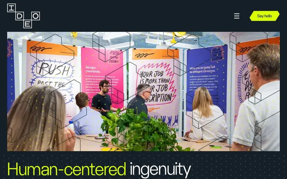
IDEO : Human-centered design — Design System
North Star
A design firm whose own site embodies its brief: bold human-centered ideas in a high-contrast, no-nonsense voice.
Theme: light
Category: agency
Tags: cool · sans-only · dark · bold · high-contrast · minimal · agency · editorial
Description
IDEO leans hard into a near-black canvas with a single radioactive-yellow accent for headlines, CTAs, and FAQ chevrons. Massive display type sets the tone (Human-centered ingenuity), while editorial photography of work, people, and case studies fills card grids underneath. Sans-serif throughout, generous vertical rhythm, and a unified design-system feel: black, yellow, gray, no third color. The site is its own portfolio.
Colors
| Name | Hex | Group | Role | Tailwind |
|---|---|---|---|---|
| neutral-50-1 | #ffffff | neutral | neutral step 50 | zinc-50 (Δ0.015) |
| green-100 | #d9ff00 | green | green step 100 | — |
| neutral-800-1 | #151f27 | neutral | neutral step 800 | — |
| neutral-700 | #333333 | neutral | neutral step 700 | — |
| blue-400 | #7b92a5 | blue | blue step 400 | — |
| blue-600-1 | #0000ee | blue | blue step 600 | — |
| neutral-800-2 | #212d3a | neutral | neutral step 800 | gray-800 (Δ0.015) |
| neutral-950 | #000000 | neutral | neutral step 950 | — |
| neutral-400 | #959494 | neutral | neutral step 400 | — |
| neutral-50-2 | #f5f8fa | neutral | neutral step 50 | slate-50 (Δ0.007) |
| blue-700 | #253342 | blue | blue step 700 | — |
| blue-600-2 | #516383 | blue | blue step 600 | — |
| blue-600-3 | #536575 | blue | blue step 600 | — |
Surfaces (Elevation)
| Level | Name | Hex | Purpose |
|---|---|---|---|
| 0 | background | #ffffff | Page background |
| 1 | surface-1 | #959494 | Cards / elevated panels |
| 2 | surface-2 | #333333 | Elevation tier 2 |
| 3 | surface-floor | #151f27 | Elevation tier 3 |
Elevation philosophy. Cards stay flat against the dark canvas with a thin lighter border. The yellow accent is the only true 'foreground' tier — everything else lives in a quiet two-tone hierarchy.
Typography
Fhoscar — weight 400
body
Manrope — weight 400
body
Type Scale
| Role | Size | Line-height | Tracking |
|---|---|---|---|
display | 90px | 0.98 | |
h2 | 40px | 1 | |
h3 | 40px | 1 | |
ui-action | 25px | 1.16 | |
ui-input | 25px | 1.4 | |
body | 14px | 1.43 | |
link | 14px | 1.43 |
Spacing & Radius
Radius
none: 0xs: 2px
Spacing
base: 1px
Layout
Vertical rhythm: hero headline → card grid of recent projects → second display headline → photo grid of people → FAQ accordion. Generous whitespace; sections breathe.
Imagery
Editorial photography of design work, case studies, and people — color-rich photos floating on the dark canvas. Yellow occasionally appears as a graphic element overlaid on imagery.
Do
- Pair the near-black background (#0E0E0E) with a single high-saturation yellow accent
- Use display-scale headlines as the primary navigational rhythm
- Frame photos in soft-cornered cards with thin borders, never shadowed
- Reserve yellow for CTAs, expand chevrons, and important inline emphasis
Don't
- Don't introduce a third color — black, yellow, gray IS the system
- Don't soften the contrast; the punch is the personality
- Don't use serif type — IDEO's voice is engineered sans, not editorial
- Don't shadow the cards — clean borders on the dark canvas do the elevation
@import "tailwindcss";

@theme {
  /* palette */
  --color-neutral-50-1: #ffffff;
  --color-green-100: #d9ff00;
  --color-neutral-800-1: #151f27;
  --color-neutral-700: #333333;
  --color-blue-400: #7b92a5;
  --color-blue-600-1: #0000ee;
  --color-neutral-800-2: #212d3a;
  --color-neutral-950: #000000;
  --color-neutral-400: #959494;
  --color-neutral-50-2: #f5f8fa;
  --color-blue-700: #253342;
  --color-blue-600-2: #516383;
  --color-blue-600-3: #536575;

  /* surfaces */
  --color-surface-0: #ffffff;
  --color-surface-1: #959494;
  --color-surface-2: #333333;
  --color-surface-3: #151f27;

  /* fonts */
  --font-fhoscar: "Fhoscar", ui-sans-serif, system-ui, sans-serif;
  --font-manrope: "Manrope", ui-sans-serif, system-ui, sans-serif;

  /* type scale (utilities: text-{role}, leading-{role}, tracking-{role}) */
  --text-display: 90px;
  --text-display--line-height: 0.98;
  --text-display--letter-spacing: nullpx;
  --text-h2: 40px;
  --text-h2--line-height: 1;
  --text-h2--letter-spacing: nullpx;
  --text-h3: 40px;
  --text-h3--line-height: 1;
  --text-h3--letter-spacing: nullpx;
  --text-ui-action: 25px;
  --text-ui-action--line-height: 1.16;
  --text-ui-action--letter-spacing: nullpx;
  --text-ui-input: 25px;
  --text-ui-input--line-height: 1.4;
  --text-ui-input--letter-spacing: nullpx;
  --text-body: 14px;
  --text-body--line-height: 1.43;
  --text-body--letter-spacing: nullpx;
  --text-link: 14px;
  --text-link--line-height: 1.43;
  --text-link--letter-spacing: nullpx;

  /* radii (utilities: rounded-{name}) */
  --radius-none: 0;
  --radius-xs: 2px;

  /* spacing (utilities: p-{key}, m-{key}, gap-{key}, …) */
  --spacing-base: 1px;
}
:root {
  /* palette */
  --color-neutral-50-1: #ffffff;
  --color-green-100: #d9ff00;
  --color-neutral-800-1: #151f27;
  --color-neutral-700: #333333;
  --color-blue-400: #7b92a5;
  --color-blue-600-1: #0000ee;
  --color-neutral-800-2: #212d3a;
  --color-neutral-950: #000000;
  --color-neutral-400: #959494;
  --color-neutral-50-2: #f5f8fa;
  --color-blue-700: #253342;
  --color-blue-600-2: #516383;
  --color-blue-600-3: #536575;

  /* surfaces */
  --surface-0: #ffffff;
  --surface-1: #959494;
  --surface-2: #333333;
  --surface-3: #151f27;

  /* type scale */
  --text-display: 90px;
  --leading-display: 0.98;
  --tracking-display: nullpx;
  --text-h2: 40px;
  --leading-h2: 1;
  --tracking-h2: nullpx;
  --text-h3: 40px;
  --leading-h3: 1;
  --tracking-h3: nullpx;
  --text-ui-action: 25px;
  --leading-ui-action: 1.16;
  --tracking-ui-action: nullpx;
  --text-ui-input: 25px;
  --leading-ui-input: 1.4;
  --tracking-ui-input: nullpx;
  --text-body: 14px;
  --leading-body: 1.43;
  --tracking-body: nullpx;
  --text-link: 14px;
  --leading-link: 1.43;
  --tracking-link: nullpx;

  /* font families */
  --font-fhoscar: "Fhoscar", ui-sans-serif, system-ui, sans-serif;
  --font-manrope: "Manrope", ui-sans-serif, system-ui, sans-serif;

  /* radii */
  --radius-none: 0;
  --radius-xs: 2px;

  /* spacing */
  --spacing-base: 1px;
}
{
  "theme": "light",
  "category": "agency",
  "tags": [
    "cool",
    "sans-only",
    "dark",
    "bold",
    "high-contrast",
    "minimal",
    "agency",
    "editorial"
  ],
  "northStar": "A design firm whose own site embodies its brief: bold human-centered ideas in a high-contrast, no-nonsense voice.",
  "description": "IDEO leans hard into a near-black canvas with a single radioactive-yellow accent for headlines, CTAs, and FAQ chevrons. Massive display type sets the tone (Human-centered ingenuity), while editorial photography of work, people, and case studies fills card grids underneath. Sans-serif throughout, generous vertical rhythm, and a unified design-system feel: black, yellow, gray, no third color. The site is its own portfolio.",
  "colors": [
    {
      "name": "neutral-50-1",
      "hex": "#ffffff",
      "group": "neutral",
      "role": "neutral step 50",
      "tailwind": {
        "name": "zinc-50",
        "hex": "#fafafa",
        "deltaE": 0.015
      }
    },
    {
      "name": "green-100",
      "hex": "#d9ff00",
      "group": "green",
      "role": "green step 100",
      "tailwind": null
    },
    {
      "name": "neutral-800-1",
      "hex": "#151f27",
      "group": "neutral",
      "role": "neutral step 800",
      "tailwind": null
    },
    {
      "name": "neutral-700",
      "hex": "#333333",
      "group": "neutral",
      "role": "neutral step 700",
      "tailwind": null
    },
    {
      "name": "blue-400",
      "hex": "#7b92a5",
      "group": "blue",
      "role": "blue step 400",
      "tailwind": null
    },
    {
      "name": "blue-600-1",
      "hex": "#0000ee",
      "group": "blue",
      "role": "blue step 600",
      "tailwind": null
    },
    {
      "name": "neutral-800-2",
      "hex": "#212d3a",
      "group": "neutral",
      "role": "neutral step 800",
      "tailwind": {
        "name": "gray-800",
        "hex": "#1e2939",
        "deltaE": 0.015
      }
    },
    {
      "name": "neutral-950",
      "hex": "#000000",
      "group": "neutral",
      "role": "neutral step 950",
      "tailwind": null
    },
    {
      "name": "neutral-400",
      "hex": "#959494",
      "group": "neutral",
      "role": "neutral step 400",
      "tailwind": null
    },
    {
      "name": "neutral-50-2",
      "hex": "#f5f8fa",
      "group": "neutral",
      "role": "neutral step 50",
      "tailwind": {
        "name": "slate-50",
        "hex": "#f8fafc",
        "deltaE": 0.007
      }
    },
    {
      "name": "blue-700",
      "hex": "#253342",
      "group": "blue",
      "role": "blue step 700",
      "tailwind": null
    },
    {
      "name": "blue-600-2",
      "hex": "#516383",
      "group": "blue",
      "role": "blue step 600",
      "tailwind": null
    },
    {
      "name": "blue-600-3",
      "hex": "#536575",
      "group": "blue",
      "role": "blue step 600",
      "tailwind": null
    }
  ],
  "surfaces": [
    {
      "level": 0,
      "name": "background",
      "hex": "#ffffff",
      "purpose": "Page background"
    },
    {
      "level": 1,
      "name": "surface-1",
      "hex": "#959494",
      "purpose": "Cards / elevated panels"
    },
    {
      "level": 2,
      "name": "surface-2",
      "hex": "#333333",
      "purpose": "Elevation tier 2"
    },
    {
      "level": 3,
      "name": "surface-floor",
      "hex": "#151f27",
      "purpose": "Elevation tier 3"
    }
  ],
  "elevationPhilosophy": "Cards stay flat against the dark canvas with a thin lighter border. The yellow accent is the only true 'foreground' tier — everything else lives in a quiet two-tone hierarchy.",
  "typography": [
    {
      "family": "Fhoscar",
      "weight": "400",
      "role": "body",
      "fontFeatureSettings": null,
      "substitute": null
    },
    {
      "family": "Manrope",
      "weight": "400",
      "role": "body",
      "fontFeatureSettings": null,
      "substitute": null
    }
  ],
  "typeScale": [
    {
      "role": "display",
      "size": 90,
      "lineHeight": 0.98,
      "letterSpacing": null
    },
    {
      "role": "h2",
      "size": 40,
      "lineHeight": 1,
      "letterSpacing": null
    },
    {
      "role": "h3",
      "size": 40,
      "lineHeight": 1,
      "letterSpacing": null
    },
    {
      "role": "ui-action",
      "size": 25,
      "lineHeight": 1.16,
      "letterSpacing": null
    },
    {
      "role": "ui-input",
      "size": 25,
      "lineHeight": 1.4,
      "letterSpacing": null
    },
    {
      "role": "body",
      "size": 14,
      "lineHeight": 1.43,
      "letterSpacing": null
    },
    {
      "role": "link",
      "size": 14,
      "lineHeight": 1.43,
      "letterSpacing": null
    }
  ],
  "spacing": {
    "radius": {
      "none": "0",
      "xs": "2px"
    },
    "base": "1px"
  },
  "layout": "Vertical rhythm: hero headline → card grid of recent projects → second display headline → photo grid of people → FAQ accordion. Generous whitespace; sections breathe.",
  "imagery": "Editorial photography of design work, case studies, and people — color-rich photos floating on the dark canvas. Yellow occasionally appears as a graphic element overlaid on imagery.",
  "dos": [
    "Pair the near-black background (#0E0E0E) with a single high-saturation yellow accent",
    "Use display-scale headlines as the primary navigational rhythm",
    "Frame photos in soft-cornered cards with thin borders, never shadowed",
    "Reserve yellow for CTAs, expand chevrons, and important inline emphasis"
  ],
  "donts": [
    "Don't introduce a third color — black, yellow, gray IS the system",
    "Don't soften the contrast; the punch is the personality",
    "Don't use serif type — IDEO's voice is engineered sans, not editorial",
    "Don't shadow the cards — clean borders on the dark canvas do the elevation"
  ],
  "brandColor": {
    "hex": "#d9ff00",
    "source": "heuristic",
    "chroma": 0.223
  }
}
{
"theme": "light",
"category": "agency",
"tags": [
"cool",
"sans-only",
"dark",
"bold",
"high-contrast",
"minimal",
"agency",
"editorial"
],
"northStar": "A design firm whose own site embodies its brief: bold human-centered ideas in a high-contrast, no-nonsense voice.",
"description": "IDEO leans hard into a near-black canvas with a single radioactive-yellow accent for headlines, CTAs, and FAQ chevrons. Massive display type sets the tone (Human-centered ingenuity), while editorial photography of work, people, and case studies fills card grids underneath. Sans-serif throughout, generous vertical rhythm, and a unified design-system feel: black, yellow, gray, no third color. The site is its own portfolio.",
"colors": [
{
"name": "neutral-50-1",
"hex": "#ffffff",
"group": "neutral",
"role": "neutral step 50",
"tailwind": {
"name": "zinc-50",
"hex": "#fafafa",
"deltaE": 0.015
}
},
{
"name": "green-100",
"hex": "#d9ff00",
"group": "green",
"role": "green step 100",
"tailwind": null
},
{
"name": "neutral-800-1",
"hex": "#151f27",
"group": "neutral",
"role": "neutral step 800",
"tailwind": null
},
{
"name": "neutral-700",
"hex": "#333333",
"group": "neutral",
"role": "neutral step 700",
"tailwind": null
},
{
"name": "blue-400",
"hex": "#7b92a5",
"group": "blue",
"role": "blue step 400",
"tailwind": null
},
{
"name": "blue-600-1",
"hex": "#0000ee",
"group": "blue",
"role": "blue step 600",
"tailwind": null
},
{
"name": "neutral-800-2",
"hex": "#212d3a",
"group": "neutral",
"role": "neutral step 800",
"tailwind": {
"name": "gray-800",
"hex": "#1e2939",
"deltaE": 0.015
}
},
{
"name": "neutral-950",
"hex": "#000000",
"group": "neutral",
"role": "neutral step 950",
"tailwind": null
},
{
"name": "neutral-400",
"hex": "#959494",
"group": "neutral",
"role": "neutral step 400",
"tailwind": null
},
{
"name": "neutral-50-2",
"hex": "#f5f8fa",
"group": "neutral",
"role": "neutral step 50",
"tailwind": {
"name": "slate-50",
"hex": "#f8fafc",
"deltaE": 0.007
}
},
{
"name": "blue-700",
"hex": "#253342",
"group": "blue",
"role": "blue step 700",
"tailwind": null
},
{
"name": "blue-600-2",
"hex": "#516383",
"group": "blue",
"role": "blue step 600",
"tailwind": null
},
{
"name": "blue-600-3",
"hex": "#536575",
"group": "blue",
"role": "blue step 600",
"tailwind": null
}
],
"surfaces": [
{
"level": 0,
"name": "background",
"hex": "#ffffff",
"purpose": "Page background"
},
{
"level": 1,
"name": "surface-1",
"hex": "#959494",
"purpose": "Cards / elevated panels"
},
{
"level": 2,
"name": "surface-2",
"hex": "#333333",
"purpose": "Elevation tier 2"
},
{
"level": 3,
"name": "surface-floor",
"hex": "#151f27",
"purpose": "Elevation tier 3"
}
],
"elevationPhilosophy": "Cards stay flat against the dark canvas with a thin lighter border. The yellow accent is the only true 'foreground' tier — everything else lives in a quiet two-tone hierarchy.",
"typography": [
{
"family": "Fhoscar",
"weight": "400",
"role": "body",
"fontFeatureSettings": null,
"substitute": null
},
{
"family": "Manrope",
"weight": "400",
"role": "body",
"fontFeatureSettings": null,
"substitute": null
}
],
"typeScale": [
{
"role": "display",
"size": 90,
"lineHeight": 0.98,
"letterSpacing": null
},
{
"role": "h2",
"size": 40,
"lineHeight": 1,
"letterSpacing": null
},
{
"role": "h3",
"size": 40,
"lineHeight": 1,
"letterSpacing": null
},
{
"role": "ui-action",
"size": 25,
"lineHeight": 1.16,
"letterSpacing": null
},
{
"role": "ui-input",
"size": 25,
"lineHeight": 1.4,
"letterSpacing": null
},
{
"role": "body",
"size": 14,
"lineHeight": 1.43,
"letterSpacing": null
},
{
"role": "link",
"size": 14,
"lineHeight": 1.43,
"letterSpacing": null
}
],
"spacing": {
"radius": {
"none": "0",
"xs": "2px"
},
"base": "1px"
},
"layout": "Vertical rhythm: hero headline → card grid of recent projects → second display headline → photo grid of people → FAQ accordion. Generous whitespace; sections breathe.",
"imagery": "Editorial photography of design work, case studies, and people — color-rich photos floating on the dark canvas. Yellow occasionally appears as a graphic element overlaid on imagery.",
"dos": [
"Pair the near-black background (#0E0E0E) with a single high-saturation yellow accent",
"Use display-scale headlines as the primary navigational rhythm",
"Frame photos in soft-cornered cards with thin borders, never shadowed",
"Reserve yellow for CTAs, expand chevrons, and important inline emphasis"
],
"donts": [
"Don't introduce a third color — black, yellow, gray IS the system",
"Don't soften the contrast; the punch is the personality",
"Don't use serif type — IDEO's voice is engineered sans, not editorial",
"Don't shadow the cards — clean borders on the dark canvas do the elevation"
],
"brandColor": {
"hex": "#d9ff00",
"source": "heuristic",
"chroma": 0.223
}
}