Lummi — Free AI Stock Images, Illustrations & 3D
www.lummi.ai ↗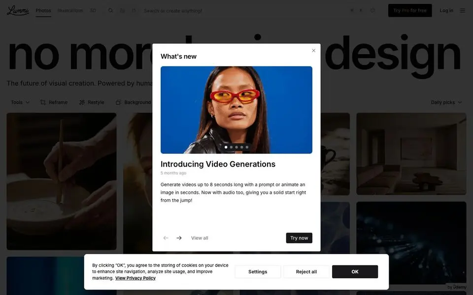
Lummi — Free AI Stock Images, Illustrations & 3D — Design System
North Star
AI-generated stock photography that doesn't look stock — every visual is a high-resolution mood.
Theme: light
Category: ai
Tags: achromatic · monochrome · pill-buttons · sans-only · dark · vibrant · spacious · ai · creative · minimal
Description
Lummi is a dark-themed visual library where the imagery is the entire interface. A black canvas, brutalist all-caps display headline ('no more stock design'), and a dense Pinterest-style mosaic of AI-generated photography below. UI chrome is minimal: a thin top filter bar, a floating 'What's new' card with feature drops. The whole system is built so users can scan thousands of images per scroll without distraction.
Colors
| Name | Hex | Group | Role | Tailwind |
|---|---|---|---|---|
| neutral-900 | #09090b | neutral | neutral step 900 | zinc-950 (Δ0) |
| neutral-50 | #ffffff | neutral | neutral step 50 | zinc-50 (Δ0.015) |
| neutral-500 | #71717a | neutral | neutral step 500 | zinc-500 (Δ0.002) |
| neutral-100 | #e4e4e7 | neutral | neutral step 100 | zinc-200 (Δ0) |
| neutral-950 | #000000 | neutral | neutral step 950 | — |
| neutral-800 | #18181b | neutral | neutral step 800 | zinc-900 (Δ0) |
Surfaces (Elevation)
| Level | Name | Hex | Purpose |
|---|---|---|---|
| 0 | background | #ffffff | Page background |
| 1 | surface-1 | #e4e4e7 | Cards / elevated panels |
| 2 | surface-2 | #71717a | Elevation tier 2 |
| 3 | surface-3 | #18181b | Elevation tier 3 |
| 4 | surface-4 | #09090b | Elevation tier 4 |
| 5 | surface-floor | #000000 | Elevation tier 5 |
Elevation philosophy. Two tiers: the dark canvas and the floating modal/feature card. Image tiles stay flat with thin gutters — no shadows, no borders, just imagery against the void.
Typography
Inter — weight 400
body
Apple Color Emoji — weight 400
body
Type Scale
| Role | Size | Line-height | Tracking |
|---|---|---|---|
display | 141.12px | 1.02 | -7.056 |
h3 | 24px | 1.33 | -0.144 |
h2 | 20px | 1.4 | -0.5 |
body | 16px | 1.5 | |
link | 14px | 1.71 | |
ui-action | 14px | 1.71 | |
ui-input | 14px | 1.71 |
Spacing & Radius
Radius
none: 0full: 9999pxsm: 4px
Spacing
base: 2px
Layout
Top filter bar with category chips, then a 4-5 column dense masonry grid of images extending forever. A single floating modal-ish card announces new features.
Imagery
The entire site IS imagery — a Pinterest-style mosaic of AI-generated photography across moods (cinematic blue tones, warm earth tones, portraiture, still life, landscapes). Tiles vary in aspect ratio.
Do
- Stay dark by default — the imagery pops harder against a black canvas
- Use a dense masonry grid; let images dictate aspect ratios
- Keep the top filter bar thin and high-contrast for scannable category navigation
- Use display-scale all-caps for hero headline; everything else is small sans labels
Don't
- Don't add white-canvas sections — the visual identity depends on the dark frame
- Don't crop images uniformly; aspect-ratio variety creates the mosaic rhythm
- Don't introduce competing accent colors; let the photography bring color in
- Don't shadow the cards — flat tiles on dark canvas, separated by gutter alone
@import "tailwindcss";

@theme {
  /* palette */
  --color-neutral-900: #09090b;
  --color-neutral-50: #ffffff;
  --color-neutral-500: #71717a;
  --color-neutral-100: #e4e4e7;
  --color-neutral-950: #000000;
  --color-neutral-800: #18181b;

  /* surfaces */
  --color-surface-0: #ffffff;
  --color-surface-1: #e4e4e7;
  --color-surface-2: #71717a;
  --color-surface-3: #18181b;
  --color-surface-4: #09090b;
  --color-surface-5: #000000;

  /* fonts */
  --font-inter: "Inter", ui-sans-serif, system-ui, sans-serif;
  --font-apple-color-emoji: "Apple Color Emoji", ui-sans-serif, system-ui, sans-serif;

  /* type scale (utilities: text-{role}, leading-{role}, tracking-{role}) */
  --text-display: 141.12px;
  --text-display--line-height: 1.02;
  --text-display--letter-spacing: -7.056px;
  --text-h3: 24px;
  --text-h3--line-height: 1.33;
  --text-h3--letter-spacing: -0.144px;
  --text-h2: 20px;
  --text-h2--line-height: 1.4;
  --text-h2--letter-spacing: -0.5px;
  --text-body: 16px;
  --text-body--line-height: 1.5;
  --text-body--letter-spacing: nullpx;
  --text-link: 14px;
  --text-link--line-height: 1.71;
  --text-link--letter-spacing: nullpx;
  --text-ui-action: 14px;
  --text-ui-action--line-height: 1.71;
  --text-ui-action--letter-spacing: nullpx;
  --text-ui-input: 14px;
  --text-ui-input--line-height: 1.71;
  --text-ui-input--letter-spacing: nullpx;

  /* radii (utilities: rounded-{name}) */
  --radius-none: 0;
  --radius-full: 9999px;
  --radius-sm: 4px;

  /* spacing (utilities: p-{key}, m-{key}, gap-{key}, …) */
  --spacing-base: 2px;
}
:root {
  /* palette */
  --color-neutral-900: #09090b;
  --color-neutral-50: #ffffff;
  --color-neutral-500: #71717a;
  --color-neutral-100: #e4e4e7;
  --color-neutral-950: #000000;
  --color-neutral-800: #18181b;

  /* surfaces */
  --surface-0: #ffffff;
  --surface-1: #e4e4e7;
  --surface-2: #71717a;
  --surface-3: #18181b;
  --surface-4: #09090b;
  --surface-5: #000000;

  /* type scale */
  --text-display: 141.12px;
  --leading-display: 1.02;
  --tracking-display: -7.056px;
  --text-h3: 24px;
  --leading-h3: 1.33;
  --tracking-h3: -0.144px;
  --text-h2: 20px;
  --leading-h2: 1.4;
  --tracking-h2: -0.5px;
  --text-body: 16px;
  --leading-body: 1.5;
  --tracking-body: nullpx;
  --text-link: 14px;
  --leading-link: 1.71;
  --tracking-link: nullpx;
  --text-ui-action: 14px;
  --leading-ui-action: 1.71;
  --tracking-ui-action: nullpx;
  --text-ui-input: 14px;
  --leading-ui-input: 1.71;
  --tracking-ui-input: nullpx;

  /* font families */
  --font-inter: "Inter", ui-sans-serif, system-ui, sans-serif;
  --font-apple-color-emoji: "Apple Color Emoji", ui-sans-serif, system-ui, sans-serif;

  /* radii */
  --radius-none: 0;
  --radius-full: 9999px;
  --radius-sm: 4px;

  /* spacing */
  --spacing-base: 2px;
}
{
  "theme": "light",
  "category": "ai",
  "tags": [
    "achromatic",
    "monochrome",
    "pill-buttons",
    "sans-only",
    "dark",
    "vibrant",
    "spacious",
    "ai",
    "creative",
    "minimal"
  ],
  "northStar": "AI-generated stock photography that doesn't look stock — every visual is a high-resolution mood.",
  "description": "Lummi is a dark-themed visual library where the imagery is the entire interface. A black canvas, brutalist all-caps display headline ('no more stock design'), and a dense Pinterest-style mosaic of AI-generated photography below. UI chrome is minimal: a thin top filter bar, a floating 'What's new' card with feature drops. The whole system is built so users can scan thousands of images per scroll without distraction.",
  "colors": [
    {
      "name": "neutral-900",
      "hex": "#09090b",
      "group": "neutral",
      "role": "neutral step 900",
      "tailwind": {
        "name": "zinc-950",
        "hex": "#09090b",
        "deltaE": 0
      }
    },
    {
      "name": "neutral-50",
      "hex": "#ffffff",
      "group": "neutral",
      "role": "neutral step 50",
      "tailwind": {
        "name": "zinc-50",
        "hex": "#fafafa",
        "deltaE": 0.015
      }
    },
    {
      "name": "neutral-500",
      "hex": "#71717a",
      "group": "neutral",
      "role": "neutral step 500",
      "tailwind": {
        "name": "zinc-500",
        "hex": "#71717b",
        "deltaE": 0.002
      }
    },
    {
      "name": "neutral-100",
      "hex": "#e4e4e7",
      "group": "neutral",
      "role": "neutral step 100",
      "tailwind": {
        "name": "zinc-200",
        "hex": "#e4e4e7",
        "deltaE": 0
      }
    },
    {
      "name": "neutral-950",
      "hex": "#000000",
      "group": "neutral",
      "role": "neutral step 950",
      "tailwind": null
    },
    {
      "name": "neutral-800",
      "hex": "#18181b",
      "group": "neutral",
      "role": "neutral step 800",
      "tailwind": {
        "name": "zinc-900",
        "hex": "#18181b",
        "deltaE": 0
      }
    }
  ],
  "surfaces": [
    {
      "level": 0,
      "name": "background",
      "hex": "#ffffff",
      "purpose": "Page background"
    },
    {
      "level": 1,
      "name": "surface-1",
      "hex": "#e4e4e7",
      "purpose": "Cards / elevated panels"
    },
    {
      "level": 2,
      "name": "surface-2",
      "hex": "#71717a",
      "purpose": "Elevation tier 2"
    },
    {
      "level": 3,
      "name": "surface-3",
      "hex": "#18181b",
      "purpose": "Elevation tier 3"
    },
    {
      "level": 4,
      "name": "surface-4",
      "hex": "#09090b",
      "purpose": "Elevation tier 4"
    },
    {
      "level": 5,
      "name": "surface-floor",
      "hex": "#000000",
      "purpose": "Elevation tier 5"
    }
  ],
  "elevationPhilosophy": "Two tiers: the dark canvas and the floating modal/feature card. Image tiles stay flat with thin gutters — no shadows, no borders, just imagery against the void.",
  "typography": [
    {
      "family": "Inter",
      "weight": "400",
      "role": "body",
      "fontFeatureSettings": null,
      "substitute": null
    },
    {
      "family": "Apple Color Emoji",
      "weight": "400",
      "role": "body",
      "fontFeatureSettings": null,
      "substitute": null
    }
  ],
  "typeScale": [
    {
      "role": "display",
      "size": 141.12,
      "lineHeight": 1.02,
      "letterSpacing": -7.056
    },
    {
      "role": "h3",
      "size": 24,
      "lineHeight": 1.33,
      "letterSpacing": -0.144
    },
    {
      "role": "h2",
      "size": 20,
      "lineHeight": 1.4,
      "letterSpacing": -0.5
    },
    {
      "role": "body",
      "size": 16,
      "lineHeight": 1.5,
      "letterSpacing": null
    },
    {
      "role": "link",
      "size": 14,
      "lineHeight": 1.71,
      "letterSpacing": null
    },
    {
      "role": "ui-action",
      "size": 14,
      "lineHeight": 1.71,
      "letterSpacing": null
    },
    {
      "role": "ui-input",
      "size": 14,
      "lineHeight": 1.71,
      "letterSpacing": null
    }
  ],
  "spacing": {
    "radius": {
      "none": "0",
      "full": "9999px",
      "sm": "4px"
    },
    "base": "2px"
  },
  "layout": "Top filter bar with category chips, then a 4-5 column dense masonry grid of images extending forever. A single floating modal-ish card announces new features.",
  "imagery": "The entire site IS imagery — a Pinterest-style mosaic of AI-generated photography across moods (cinematic blue tones, warm earth tones, portraiture, still life, landscapes). Tiles vary in aspect ratio.",
  "dos": [
    "Stay dark by default — the imagery pops harder against a black canvas",
    "Use a dense masonry grid; let images dictate aspect ratios",
    "Keep the top filter bar thin and high-contrast for scannable category navigation",
    "Use display-scale all-caps for hero headline; everything else is small sans labels"
  ],
  "donts": [
    "Don't add white-canvas sections — the visual identity depends on the dark frame",
    "Don't crop images uniformly; aspect-ratio variety creates the mosaic rhythm",
    "Don't introduce competing accent colors; let the photography bring color in",
    "Don't shadow the cards — flat tiles on dark canvas, separated by gutter alone"
  ],
  "brandColor": null
}
{
"theme": "light",
"category": "ai",
"tags": [
"achromatic",
"monochrome",
"pill-buttons",
"sans-only",
"dark",
"vibrant",
"spacious",
"ai",
"creative",
"minimal"
],
"northStar": "AI-generated stock photography that doesn't look stock — every visual is a high-resolution mood.",
"description": "Lummi is a dark-themed visual library where the imagery is the entire interface. A black canvas, brutalist all-caps display headline ('no more stock design'), and a dense Pinterest-style mosaic of AI-generated photography below. UI chrome is minimal: a thin top filter bar, a floating 'What's new' card with feature drops. The whole system is built so users can scan thousands of images per scroll without distraction.",
"colors": [
{
"name": "neutral-900",
"hex": "#09090b",
"group": "neutral",
"role": "neutral step 900",
"tailwind": {
"name": "zinc-950",
"hex": "#09090b",
"deltaE": 0
}
},
{
"name": "neutral-50",
"hex": "#ffffff",
"group": "neutral",
"role": "neutral step 50",
"tailwind": {
"name": "zinc-50",
"hex": "#fafafa",
"deltaE": 0.015
}
},
{
"name": "neutral-500",
"hex": "#71717a",
"group": "neutral",
"role": "neutral step 500",
"tailwind": {
"name": "zinc-500",
"hex": "#71717b",
"deltaE": 0.002
}
},
{
"name": "neutral-100",
"hex": "#e4e4e7",
"group": "neutral",
"role": "neutral step 100",
"tailwind": {
"name": "zinc-200",
"hex": "#e4e4e7",
"deltaE": 0
}
},
{
"name": "neutral-950",
"hex": "#000000",
"group": "neutral",
"role": "neutral step 950",
"tailwind": null
},
{
"name": "neutral-800",
"hex": "#18181b",
"group": "neutral",
"role": "neutral step 800",
"tailwind": {
"name": "zinc-900",
"hex": "#18181b",
"deltaE": 0
}
}
],
"surfaces": [
{
"level": 0,
"name": "background",
"hex": "#ffffff",
"purpose": "Page background"
},
{
"level": 1,
"name": "surface-1",
"hex": "#e4e4e7",
"purpose": "Cards / elevated panels"
},
{
"level": 2,
"name": "surface-2",
"hex": "#71717a",
"purpose": "Elevation tier 2"
},
{
"level": 3,
"name": "surface-3",
"hex": "#18181b",
"purpose": "Elevation tier 3"
},
{
"level": 4,
"name": "surface-4",
"hex": "#09090b",
"purpose": "Elevation tier 4"
},
{
"level": 5,
"name": "surface-floor",
"hex": "#000000",
"purpose": "Elevation tier 5"
}
],
"elevationPhilosophy": "Two tiers: the dark canvas and the floating modal/feature card. Image tiles stay flat with thin gutters — no shadows, no borders, just imagery against the void.",
"typography": [
{
"family": "Inter",
"weight": "400",
"role": "body",
"fontFeatureSettings": null,
"substitute": null
},
{
"family": "Apple Color Emoji",
"weight": "400",
"role": "body",
"fontFeatureSettings": null,
"substitute": null
}
],
"typeScale": [
{
"role": "display",
"size": 141.12,
"lineHeight": 1.02,
"letterSpacing": -7.056
},
{
"role": "h3",
"size": 24,
"lineHeight": 1.33,
"letterSpacing": -0.144
},
{
"role": "h2",
"size": 20,
"lineHeight": 1.4,
"letterSpacing": -0.5
},
{
"role": "body",
"size": 16,
"lineHeight": 1.5,
"letterSpacing": null
},
{
"role": "link",
"size": 14,
"lineHeight": 1.71,
"letterSpacing": null
},
{
"role": "ui-action",
"size": 14,
"lineHeight": 1.71,
"letterSpacing": null
},
{
"role": "ui-input",
"size": 14,
"lineHeight": 1.71,
"letterSpacing": null
}
],
"spacing": {
"radius": {
"none": "0",
"full": "9999px",
"sm": "4px"
},
"base": "2px"
},
"layout": "Top filter bar with category chips, then a 4-5 column dense masonry grid of images extending forever. A single floating modal-ish card announces new features.",
"imagery": "The entire site IS imagery — a Pinterest-style mosaic of AI-generated photography across moods (cinematic blue tones, warm earth tones, portraiture, still life, landscapes). Tiles vary in aspect ratio.",
"dos": [
"Stay dark by default — the imagery pops harder against a black canvas",
"Use a dense masonry grid; let images dictate aspect ratios",
"Keep the top filter bar thin and high-contrast for scannable category navigation",
"Use display-scale all-caps for hero headline; everything else is small sans labels"
],
"donts": [
"Don't add white-canvas sections — the visual identity depends on the dark frame",
"Don't crop images uniformly; aspect-ratio variety creates the mosaic rhythm",
"Don't introduce competing accent colors; let the photography bring color in",
"Don't shadow the cards — flat tiles on dark canvas, separated by gutter alone"
],
"brandColor": null
}