AKQA
www.akqa.com ↗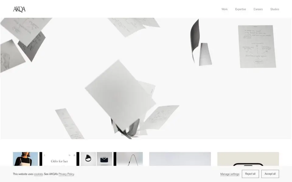
AKQA — Design System
North Star
An agency portfolio that lets the work breathe — quiet chrome, big imagery, every grid cell a story.
Theme: light
Category: agency
Tags: achromatic · monochrome · square · minimal · editorial · spacious · agency · premium · asymmetric
Description
AKQA's site is almost all photography and case-study tiles with the absolute minimum of chrome. A near-white canvas, a slim sans-serif logo and nav at the top, and a varied-cell grid below that mixes phone mockups, on-set photography, brand films, and motion poster art. Typography stays understated — labels and titles in a small editorial sans — letting each project's imagery dominate. The voice is confident, premium, restrained.
Colors
| Name | Hex | Group | Role | Tailwind |
|---|---|---|---|---|
| neutral-700 | #414141 | neutral | neutral step 700 | neutral-700 (Δ0.004) |
| neutral-900 | #121212 | neutral | neutral step 900 | neutral-900 (Δ0.022) |
| neutral-50-1 | #ffffff | neutral | neutral step 50 | zinc-50 (Δ0.015) |
| neutral-500 | #717171 | neutral | neutral step 500 | neutral-500 (Δ0.007) |
| neutral-400 | #989898 | neutral | neutral step 400 | — |
| neutral-800 | #222222 | neutral | neutral step 800 | neutral-800 (Δ0.017) |
| neutral-950 | #000000 | neutral | neutral step 950 | — |
| neutral-50-2 | #f8f8f8 | neutral | neutral step 50 | gray-50 (Δ0.006) |
Surfaces (Elevation)
| Level | Name | Hex | Purpose |
|---|---|---|---|
| 0 | background | #ffffff | Page background |
| 1 | surface-1 | #989898 | Cards / elevated panels |
| 2 | surface-2 | #717171 | Elevation tier 2 |
| 3 | surface-3 | #414141 | Elevation tier 3 |
| 4 | surface-floor | #222222 | Elevation tier 4 |
Elevation philosophy. Almost completely flat. The grid relies on white-space gutters and the imagery itself to imply layering. Hover states subtly lift and zoom but the rest of the time the canvas reads like a printed page.
Typography
goudy-old-style — weight 400
body
Times New Roman — weight 400
serif
akzidenz-grotesk-pro — weight 400
h4
Type Scale
| Role | Size | Line-height | Tracking |
|---|---|---|---|
h3 | 38px | 1.21 | -1 |
body | 16px | 1.63 | |
link | 16px | 1.63 | |
h4 | 14px | 1 | -0.2 |
ui-action | 14px | 1.29 | -0.2 |
Spacing & Radius
Radius
none: 0
Spacing
base: 2px
Layout
A varied-cell grid (mosaic-style) — large feature cells next to smaller ones, mixing aspect ratios. Top has a three-item primary nav. Bottom is a small, dense footer with utility links.
Imagery
A constant rotation of project work: phone mockups, on-set photography, motion film stills, brand identity boards. Each tile is a different aspect ratio, building a visual rhythm. People, products, places — all premium, all on-brand for the client.
Do
- Let project imagery occupy the largest cells — chrome plays second to the work
- Use varied-size grid cells; uniform grids feel too clinical for creative work
- Set labels and titles in a small editorial sans, kept low-contrast
- Reserve color for the work itself; the canvas should stay near-white or near-black
Don't
- Don't overlay heavy chrome on imagery — captions sit BELOW each cell, not on top
- Don't use a uniform grid; vary cell heights and widths to create rhythm
- Don't introduce loud accent colors; the imagery already brings color in
- Don't crowd the nav — three or four items max, top-aligned, always thin
@import "tailwindcss";

@theme {
  /* palette */
  --color-neutral-700: #414141;
  --color-neutral-900: #121212;
  --color-neutral-50-1: #ffffff;
  --color-neutral-500: #717171;
  --color-neutral-400: #989898;
  --color-neutral-800: #222222;
  --color-neutral-950: #000000;
  --color-neutral-50-2: #f8f8f8;

  /* surfaces */
  --color-surface-0: #ffffff;
  --color-surface-1: #989898;
  --color-surface-2: #717171;
  --color-surface-3: #414141;
  --color-surface-4: #222222;

  /* fonts */
  --font-goudy-old-style: "goudy-old-style", ui-sans-serif, system-ui, sans-serif;
  --font-times-new-roman: "Times New Roman", ui-sans-serif, system-ui, sans-serif;
  --font-akzidenz-grotesk-pro: "akzidenz-grotesk-pro", ui-sans-serif, system-ui, sans-serif;

  /* type scale (utilities: text-{role}, leading-{role}, tracking-{role}) */
  --text-h3: 38px;
  --text-h3--line-height: 1.21;
  --text-h3--letter-spacing: -1px;
  --text-body: 16px;
  --text-body--line-height: 1.63;
  --text-body--letter-spacing: nullpx;
  --text-link: 16px;
  --text-link--line-height: 1.63;
  --text-link--letter-spacing: nullpx;
  --text-h4: 14px;
  --text-h4--line-height: 1;
  --text-h4--letter-spacing: -0.2px;
  --text-ui-action: 14px;
  --text-ui-action--line-height: 1.29;
  --text-ui-action--letter-spacing: -0.2px;

  /* radii (utilities: rounded-{name}) */
  --radius-none: 0;

  /* spacing (utilities: p-{key}, m-{key}, gap-{key}, …) */
  --spacing-base: 2px;
}
:root {
  /* palette */
  --color-neutral-700: #414141;
  --color-neutral-900: #121212;
  --color-neutral-50-1: #ffffff;
  --color-neutral-500: #717171;
  --color-neutral-400: #989898;
  --color-neutral-800: #222222;
  --color-neutral-950: #000000;
  --color-neutral-50-2: #f8f8f8;

  /* surfaces */
  --surface-0: #ffffff;
  --surface-1: #989898;
  --surface-2: #717171;
  --surface-3: #414141;
  --surface-4: #222222;

  /* type scale */
  --text-h3: 38px;
  --leading-h3: 1.21;
  --tracking-h3: -1px;
  --text-body: 16px;
  --leading-body: 1.63;
  --tracking-body: nullpx;
  --text-link: 16px;
  --leading-link: 1.63;
  --tracking-link: nullpx;
  --text-h4: 14px;
  --leading-h4: 1;
  --tracking-h4: -0.2px;
  --text-ui-action: 14px;
  --leading-ui-action: 1.29;
  --tracking-ui-action: -0.2px;

  /* font families */
  --font-goudy-old-style: "goudy-old-style", ui-sans-serif, system-ui, sans-serif;
  --font-times-new-roman: "Times New Roman", ui-sans-serif, system-ui, sans-serif;
  --font-akzidenz-grotesk-pro: "akzidenz-grotesk-pro", ui-sans-serif, system-ui, sans-serif;

  /* radii */
  --radius-none: 0;

  /* spacing */
  --spacing-base: 2px;
}
{
  "theme": "light",
  "category": "agency",
  "tags": [
    "achromatic",
    "monochrome",
    "square",
    "minimal",
    "editorial",
    "spacious",
    "agency",
    "premium",
    "asymmetric"
  ],
  "northStar": "An agency portfolio that lets the work breathe — quiet chrome, big imagery, every grid cell a story.",
  "description": "AKQA's site is almost all photography and case-study tiles with the absolute minimum of chrome. A near-white canvas, a slim sans-serif logo and nav at the top, and a varied-cell grid below that mixes phone mockups, on-set photography, brand films, and motion poster art. Typography stays understated — labels and titles in a small editorial sans — letting each project's imagery dominate. The voice is confident, premium, restrained.",
  "colors": [
    {
      "name": "neutral-700",
      "hex": "#414141",
      "group": "neutral",
      "role": "neutral step 700",
      "tailwind": {
        "name": "neutral-700",
        "hex": "#404040",
        "deltaE": 0.004
      }
    },
    {
      "name": "neutral-900",
      "hex": "#121212",
      "group": "neutral",
      "role": "neutral step 900",
      "tailwind": {
        "name": "neutral-900",
        "hex": "#171717",
        "deltaE": 0.022
      }
    },
    {
      "name": "neutral-50-1",
      "hex": "#ffffff",
      "group": "neutral",
      "role": "neutral step 50",
      "tailwind": {
        "name": "zinc-50",
        "hex": "#fafafa",
        "deltaE": 0.015
      }
    },
    {
      "name": "neutral-500",
      "hex": "#717171",
      "group": "neutral",
      "role": "neutral step 500",
      "tailwind": {
        "name": "neutral-500",
        "hex": "#737373",
        "deltaE": 0.007
      }
    },
    {
      "name": "neutral-400",
      "hex": "#989898",
      "group": "neutral",
      "role": "neutral step 400",
      "tailwind": null
    },
    {
      "name": "neutral-800",
      "hex": "#222222",
      "group": "neutral",
      "role": "neutral step 800",
      "tailwind": {
        "name": "neutral-800",
        "hex": "#262626",
        "deltaE": 0.017
      }
    },
    {
      "name": "neutral-950",
      "hex": "#000000",
      "group": "neutral",
      "role": "neutral step 950",
      "tailwind": null
    },
    {
      "name": "neutral-50-2",
      "hex": "#f8f8f8",
      "group": "neutral",
      "role": "neutral step 50",
      "tailwind": {
        "name": "gray-50",
        "hex": "#f9fafb",
        "deltaE": 0.006
      }
    }
  ],
  "surfaces": [
    {
      "level": 0,
      "name": "background",
      "hex": "#ffffff",
      "purpose": "Page background"
    },
    {
      "level": 1,
      "name": "surface-1",
      "hex": "#989898",
      "purpose": "Cards / elevated panels"
    },
    {
      "level": 2,
      "name": "surface-2",
      "hex": "#717171",
      "purpose": "Elevation tier 2"
    },
    {
      "level": 3,
      "name": "surface-3",
      "hex": "#414141",
      "purpose": "Elevation tier 3"
    },
    {
      "level": 4,
      "name": "surface-floor",
      "hex": "#222222",
      "purpose": "Elevation tier 4"
    }
  ],
  "elevationPhilosophy": "Almost completely flat. The grid relies on white-space gutters and the imagery itself to imply layering. Hover states subtly lift and zoom but the rest of the time the canvas reads like a printed page.",
  "typography": [
    {
      "family": "goudy-old-style",
      "weight": "400",
      "role": "body",
      "fontFeatureSettings": null,
      "substitute": null
    },
    {
      "family": "Times New Roman",
      "weight": "400",
      "role": "serif",
      "fontFeatureSettings": null,
      "substitute": null
    },
    {
      "family": "akzidenz-grotesk-pro",
      "weight": "400",
      "role": "h4",
      "fontFeatureSettings": null,
      "substitute": null
    }
  ],
  "typeScale": [
    {
      "role": "h3",
      "size": 38,
      "lineHeight": 1.21,
      "letterSpacing": -1
    },
    {
      "role": "body",
      "size": 16,
      "lineHeight": 1.63,
      "letterSpacing": null
    },
    {
      "role": "link",
      "size": 16,
      "lineHeight": 1.63,
      "letterSpacing": null
    },
    {
      "role": "h4",
      "size": 14,
      "lineHeight": 1,
      "letterSpacing": -0.2
    },
    {
      "role": "ui-action",
      "size": 14,
      "lineHeight": 1.29,
      "letterSpacing": -0.2
    }
  ],
  "spacing": {
    "radius": {
      "none": "0"
    },
    "base": "2px"
  },
  "layout": "A varied-cell grid (mosaic-style) — large feature cells next to smaller ones, mixing aspect ratios. Top has a three-item primary nav. Bottom is a small, dense footer with utility links.",
  "imagery": "A constant rotation of project work: phone mockups, on-set photography, motion film stills, brand identity boards. Each tile is a different aspect ratio, building a visual rhythm. People, products, places — all premium, all on-brand for the client.",
  "dos": [
    "Let project imagery occupy the largest cells — chrome plays second to the work",
    "Use varied-size grid cells; uniform grids feel too clinical for creative work",
    "Set labels and titles in a small editorial sans, kept low-contrast",
    "Reserve color for the work itself; the canvas should stay near-white or near-black"
  ],
  "donts": [
    "Don't overlay heavy chrome on imagery — captions sit BELOW each cell, not on top",
    "Don't use a uniform grid; vary cell heights and widths to create rhythm",
    "Don't introduce loud accent colors; the imagery already brings color in",
    "Don't crowd the nav — three or four items max, top-aligned, always thin"
  ],
  "brandColor": null
}
{
"theme": "light",
"category": "agency",
"tags": [
"achromatic",
"monochrome",
"square",
"minimal",
"editorial",
"spacious",
"agency",
"premium",
"asymmetric"
],
"northStar": "An agency portfolio that lets the work breathe — quiet chrome, big imagery, every grid cell a story.",
"description": "AKQA's site is almost all photography and case-study tiles with the absolute minimum of chrome. A near-white canvas, a slim sans-serif logo and nav at the top, and a varied-cell grid below that mixes phone mockups, on-set photography, brand films, and motion poster art. Typography stays understated — labels and titles in a small editorial sans — letting each project's imagery dominate. The voice is confident, premium, restrained.",
"colors": [
{
"name": "neutral-700",
"hex": "#414141",
"group": "neutral",
"role": "neutral step 700",
"tailwind": {
"name": "neutral-700",
"hex": "#404040",
"deltaE": 0.004
}
},
{
"name": "neutral-900",
"hex": "#121212",
"group": "neutral",
"role": "neutral step 900",
"tailwind": {
"name": "neutral-900",
"hex": "#171717",
"deltaE": 0.022
}
},
{
"name": "neutral-50-1",
"hex": "#ffffff",
"group": "neutral",
"role": "neutral step 50",
"tailwind": {
"name": "zinc-50",
"hex": "#fafafa",
"deltaE": 0.015
}
},
{
"name": "neutral-500",
"hex": "#717171",
"group": "neutral",
"role": "neutral step 500",
"tailwind": {
"name": "neutral-500",
"hex": "#737373",
"deltaE": 0.007
}
},
{
"name": "neutral-400",
"hex": "#989898",
"group": "neutral",
"role": "neutral step 400",
"tailwind": null
},
{
"name": "neutral-800",
"hex": "#222222",
"group": "neutral",
"role": "neutral step 800",
"tailwind": {
"name": "neutral-800",
"hex": "#262626",
"deltaE": 0.017
}
},
{
"name": "neutral-950",
"hex": "#000000",
"group": "neutral",
"role": "neutral step 950",
"tailwind": null
},
{
"name": "neutral-50-2",
"hex": "#f8f8f8",
"group": "neutral",
"role": "neutral step 50",
"tailwind": {
"name": "gray-50",
"hex": "#f9fafb",
"deltaE": 0.006
}
}
],
"surfaces": [
{
"level": 0,
"name": "background",
"hex": "#ffffff",
"purpose": "Page background"
},
{
"level": 1,
"name": "surface-1",
"hex": "#989898",
"purpose": "Cards / elevated panels"
},
{
"level": 2,
"name": "surface-2",
"hex": "#717171",
"purpose": "Elevation tier 2"
},
{
"level": 3,
"name": "surface-3",
"hex": "#414141",
"purpose": "Elevation tier 3"
},
{
"level": 4,
"name": "surface-floor",
"hex": "#222222",
"purpose": "Elevation tier 4"
}
],
"elevationPhilosophy": "Almost completely flat. The grid relies on white-space gutters and the imagery itself to imply layering. Hover states subtly lift and zoom but the rest of the time the canvas reads like a printed page.",
"typography": [
{
"family": "goudy-old-style",
"weight": "400",
"role": "body",
"fontFeatureSettings": null,
"substitute": null
},
{
"family": "Times New Roman",
"weight": "400",
"role": "serif",
"fontFeatureSettings": null,
"substitute": null
},
{
"family": "akzidenz-grotesk-pro",
"weight": "400",
"role": "h4",
"fontFeatureSettings": null,
"substitute": null
}
],
"typeScale": [
{
"role": "h3",
"size": 38,
"lineHeight": 1.21,
"letterSpacing": -1
},
{
"role": "body",
"size": 16,
"lineHeight": 1.63,
"letterSpacing": null
},
{
"role": "link",
"size": 16,
"lineHeight": 1.63,
"letterSpacing": null
},
{
"role": "h4",
"size": 14,
"lineHeight": 1,
"letterSpacing": -0.2
},
{
"role": "ui-action",
"size": 14,
"lineHeight": 1.29,
"letterSpacing": -0.2
}
],
"spacing": {
"radius": {
"none": "0"
},
"base": "2px"
},
"layout": "A varied-cell grid (mosaic-style) — large feature cells next to smaller ones, mixing aspect ratios. Top has a three-item primary nav. Bottom is a small, dense footer with utility links.",
"imagery": "A constant rotation of project work: phone mockups, on-set photography, motion film stills, brand identity boards. Each tile is a different aspect ratio, building a visual rhythm. People, products, places — all premium, all on-brand for the client.",
"dos": [
"Let project imagery occupy the largest cells — chrome plays second to the work",
"Use varied-size grid cells; uniform grids feel too clinical for creative work",
"Set labels and titles in a small editorial sans, kept low-contrast",
"Reserve color for the work itself; the canvas should stay near-white or near-black"
],
"donts": [
"Don't overlay heavy chrome on imagery — captions sit BELOW each cell, not on top",
"Don't use a uniform grid; vary cell heights and widths to create rhythm",
"Don't introduce loud accent colors; the imagery already brings color in",
"Don't crowd the nav — three or four items max, top-aligned, always thin"
],
"brandColor": null
}